PART ONE : Customizing an IKEA kitchen: Our design + reno process with the inside scoop on how you can do it too.
So many of you have asked (okay, ok, kk… three people JK ) how we create our signature style. We really enjoy filling spaces with a sense of calm + hygge warmth. Our signature style can be seen here in our home, cabin, treehouse and spaces we share on Instagram. You can do it too! You can mirror our signature style in your home, cottage, apartment and of course, even your RV. Alllll of them.
Lately, we’ve been sketching kitchen decor plans, shopping accessories, whitewash refinishing the floors and eating popcorn. But not all at once. That would just be gross.
Our secret to making a HOME vision come to life: plan in layers.
If you’d like to skip ahead to the {almost} finished kitchen, you can see it here 🙂
1.
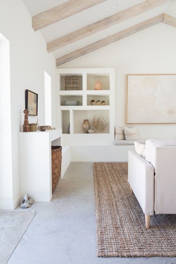
As a base, we try to imagine a light airy space, combined with a soft yet minimalist style mixed with smaller textural elements.
2.
We love white and the staggering simplicity it brings to a space. We paint our walls, ceiling and trim with Simply White OC 117 by Benjamin Moore (we just change up the sheen level to matte on walls and ceiling and a more glossy finish on trim.) The best part is, it is all one colour, so no need to fuss.
3.
Do you have an iPad and apple pencil? It’s essential in our design tool box. We use an app called Procreate.
4.
We draw the space out and move furniture around (virtually) with a pencil. We test what works where and what doesn’t. Don’t have an iPad? You can also sketch it on a paper (or a dinner napkin….been there, done that too) That, and cardboard boxes are super for testing how things fit in a space.
5.
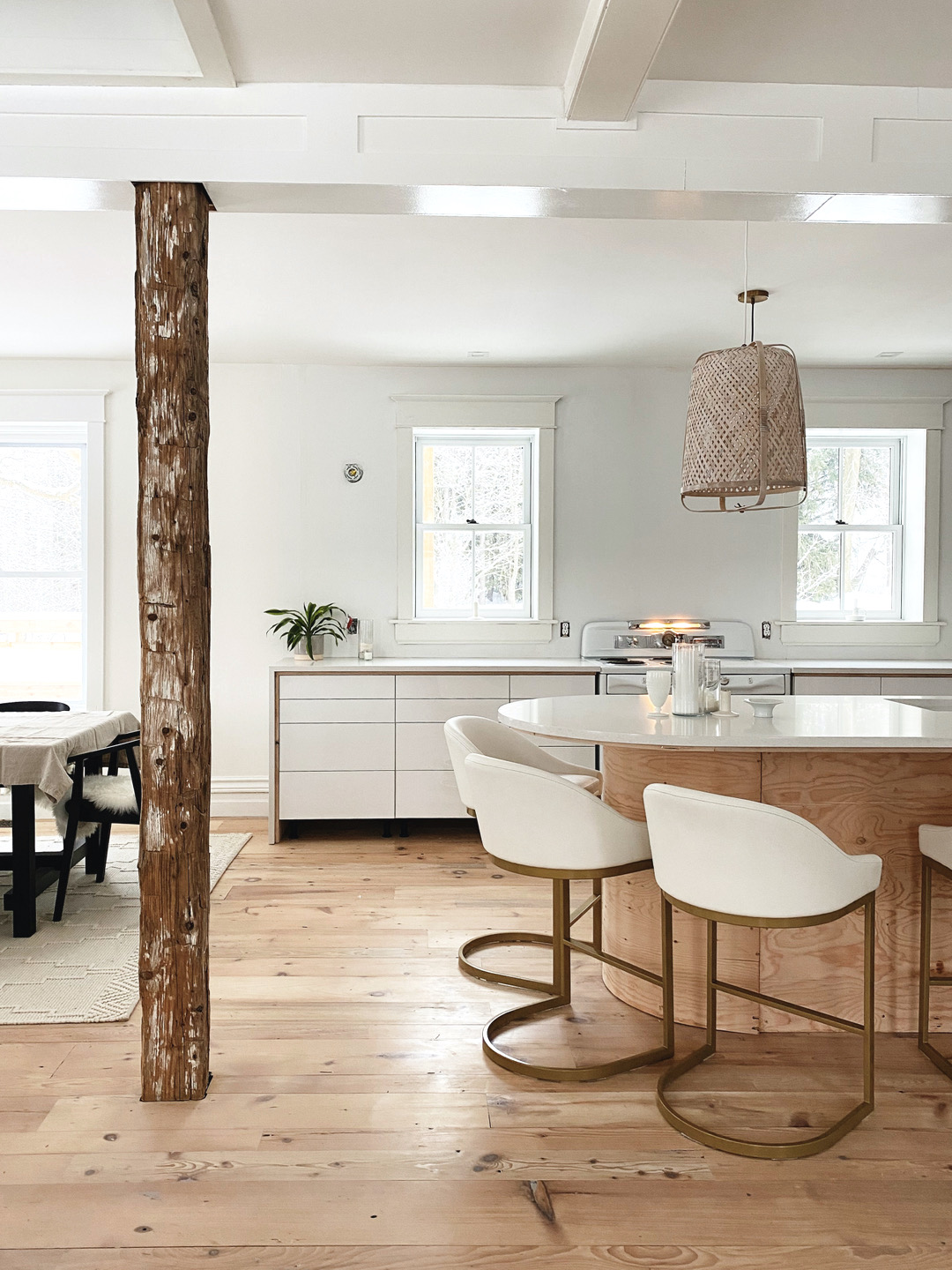
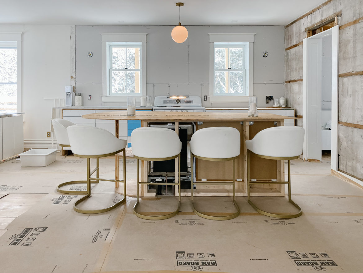
Yup. Don’t laugh, but cardboard boxes are d’bomb of fabulousness. We place our ‘furniture’ with cardboard boxes and tape off the floor for items that we may not have enough cardboard for. It is ahhhhmazing how this helps to really feel out the space. If the cardboard layout works, we start to add the ‘real life’ elements. For our island, we used a piece of plywood to get a sense of countertop space and easy / difficult it was to have walking space and room for stools (that always never seem to tuck themselves in). WTF? Weird. I need a magic wand.
6.
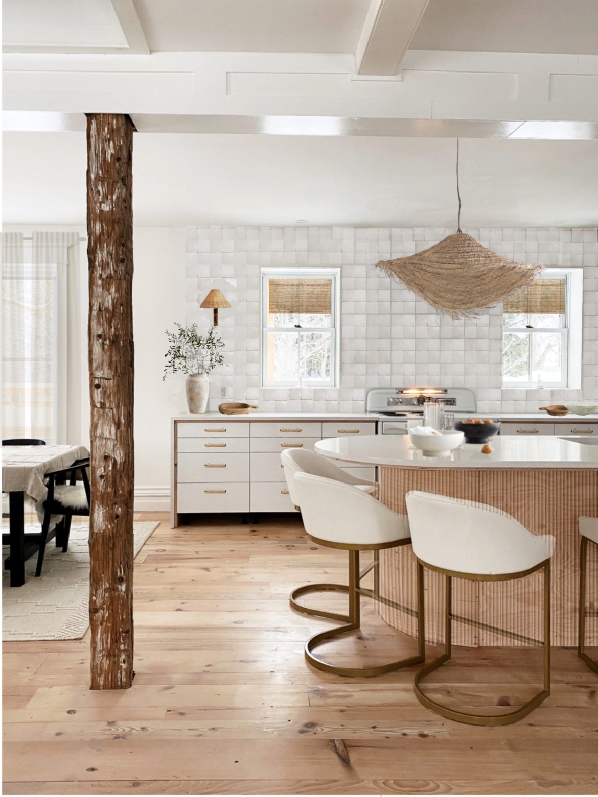
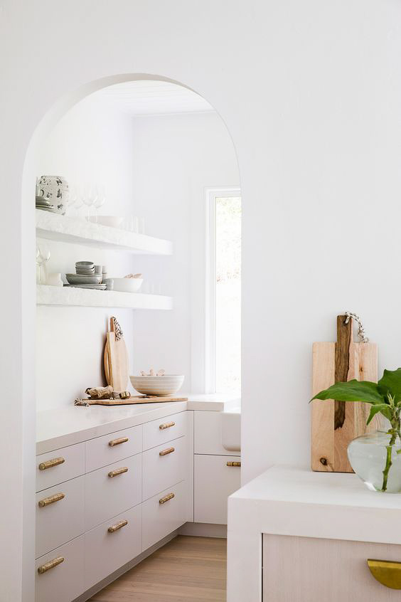
Get inspired. We grabbed a whole lotta inspo here too. Just a tiny place they call PINTEREST 🙂 Our sweet savings grace for helping us to design the beautiful spaces in the kitchen was friend and fellow designer Sarah, from The Curated House. She came up with the gorgeous idea of layering wood under our quartz countertop and how to up-level our fluting game around the island. LOVE.
7.
SKETCH IT OUT IRL : This sketch helped us to decide that we liked having a light off centre (to the left) and therefore decided to set our sink off centre as well (to the right). Which way is up? LOL. The sketch helped us to see that moving the sink to the right side of the island would also balance the overall asymmetry (which we realllllly LOVE.)
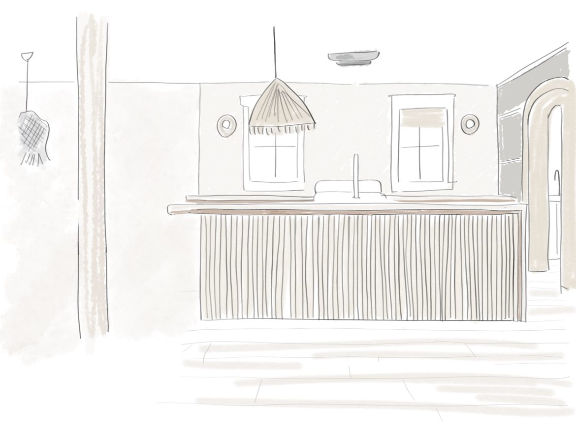
ARCHES + ASYMMETRY : We continued the asymmetry by having a waterfall on one side and an arched edge on the other end of the island. We decided on an arch trim to the pantry to balance it all out and give soft lines for a more soothing feel.
TRIM + BACKSPLASH : Even though we drew trim on the walls, this sketch helped us decide to remove the trim around the windows with the idea of letting the wall finish be the start of the show.
Our idea is to plaster the walls with Portola paints.
8.
Next up, decide on the larger pieces in a room. We decided on IKEA Ringhult High gloss white cabinetry and for the countertop we created a vintage wood underlay with quartz in a waterfall. The wood underlay and quartz waterfall helped to create a customized look for an IKEA kitchen. PS. there will be many more blog posts coming out about that, showing each element as we build it out. Because we are so freakin’ excited ’bout that!
9.
THE DETAILS : Legit, this is one of our favourite parts! We love the rich warm feeling of cozy textures and bringing comfort into spaces in layers. We build mood boards, draw on our favourite elements and plan products that we have used for years (for example, Delta Faucet) as well as test out new products. For new products, we buy samples ( we officially have 73957495475 drawer hardware samples in the house right now) and we also test things virtually by adding them in our procreate sketches. Adding products in a sketch is such a sweet way to try products in a room before you buy them.
SOURCES :
- The rest of the kitchen is alllllll IKEA Canada Ringhult High gloss white cabinetry. It’s so beautiful !! We’ve been customizing it every step of the way. Slow, hygge style.
- We found some really pretty rattan handles from Anthropologie and woven pendant lighting which will soon be listed in our shop
- Our biggest splurge : we bought a new oven. It’s the first time we have ever splurged on an oven. In 25 years. Not.Even.Kidding. It may take 12 months, 3 weeks, 2 days, 1 hour and 49 seconds to get here, but I hear that all good things are worth waiting for 🙂
10.
Lastly, we add in the slow intentional elements as the finishing touch: our favourite candles, tableware, linen tablecloth, linen napkins on the table, bowls, trays, greenery, and art.
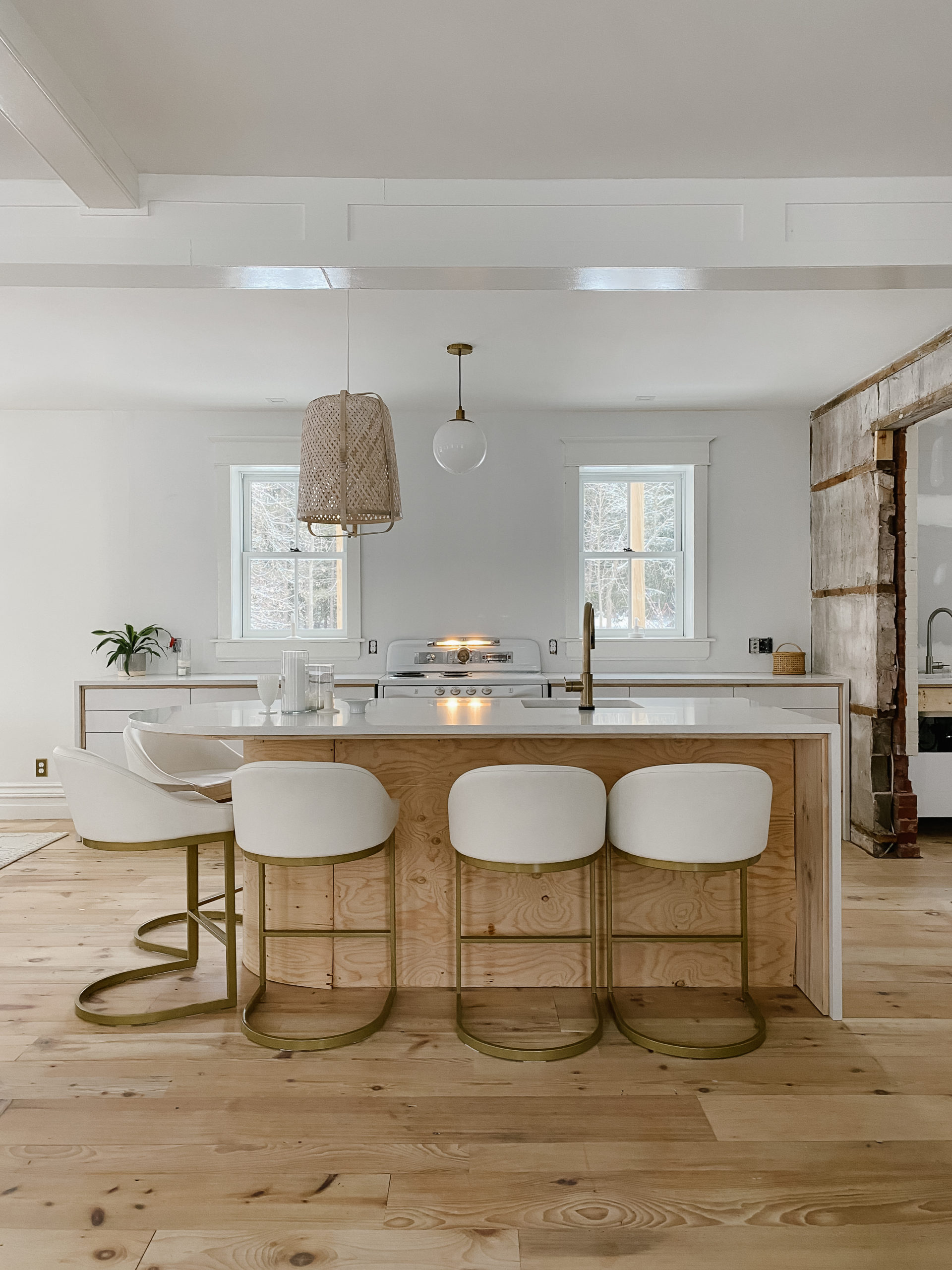
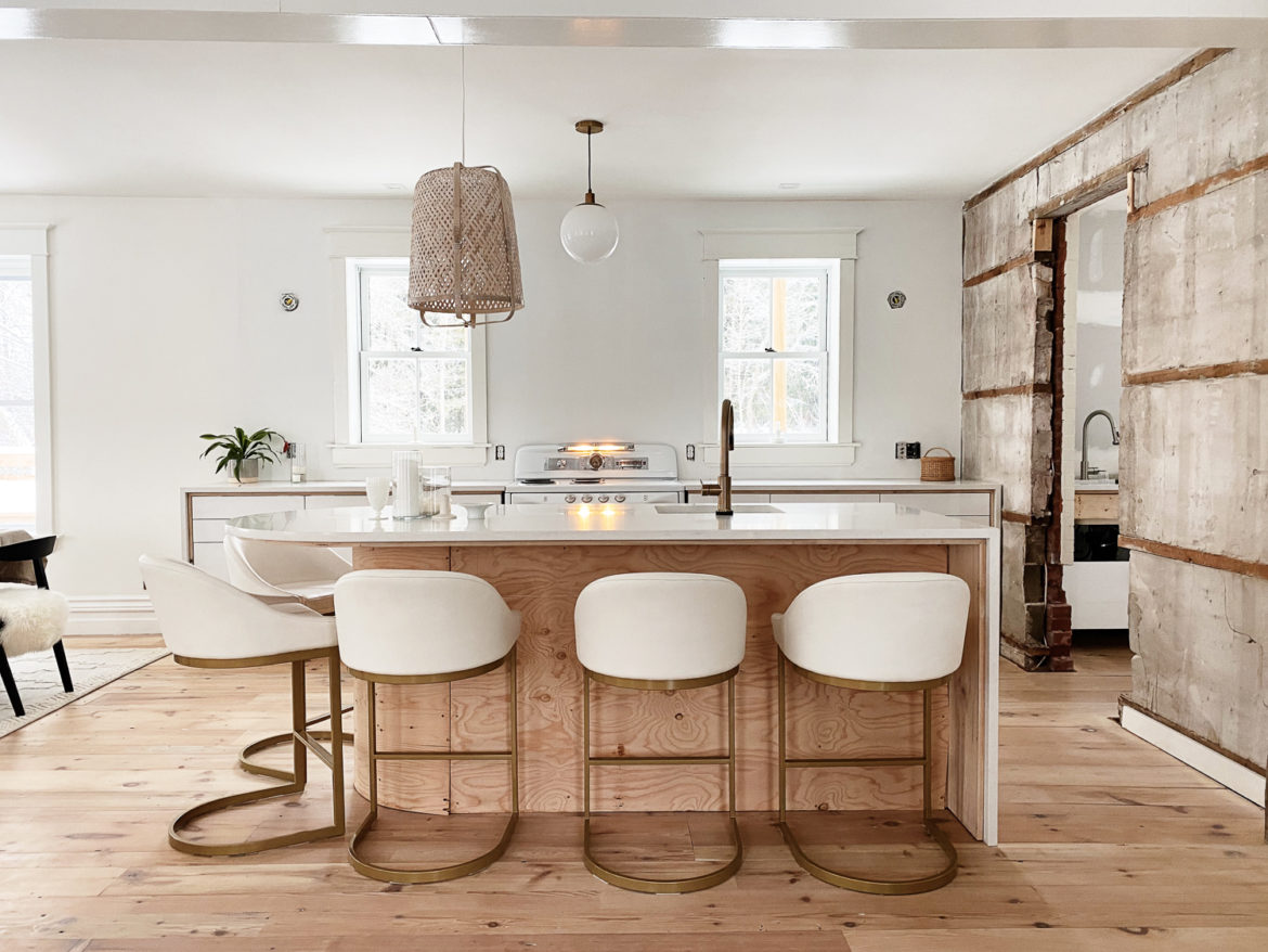
Here are the {almost} final progress photos of the kitchen. And you can see it here in our Instagram stories too!
Here are the items we purchased for our kitchen and great room….
Ready to give it a try?
Start with one nook. One cranny. One space. Even one corner of a room. One thing. Then take the next step. Need help? Get more inspo throughout the blog and see our sources on LikeToKnow.it
PS. we love ya. Boom.
